
Tabbed sidebar Sections
Tabbed Sections are set up similarly to regular sections, except that they allow you to arrange your widgets into tabs. This can make a long page shorter or give a nice hierarchy to information on a given page.
Because we made the tabs their own sections, you can mix your different widgets on each tab (or together on the same tab) to give you the maximum amount of flexibility and ease of use.
For example, you may want to set up tabs for different customer locations. Each location will need its own content area, CPT based gallery of brands, and a contact form. You could use the tab section on each location page to hold the different widgets, or you could use one tab for each location and have all the necessary widgets on each location’s tab. The same tool will handle both scenarios.
For example, you may want to set up tabs for different customer locations. Each location will need its own content area, CPT based gallery of brands, and a contact form. You could use the tab section on each location page to hold the different widgets, or you could use one tab for each location and have all the necessary widgets on each location’s tab. The same tool will handle both scenarios.
Creating a Tabbed Sidebar Section
Click on the Add Section button in the editor. The standard screen will pop up, but now you'll see tabs across the top for different types of sections you can add. Click TABBED SECTIONS .
Here is the default tabbed sections screen.
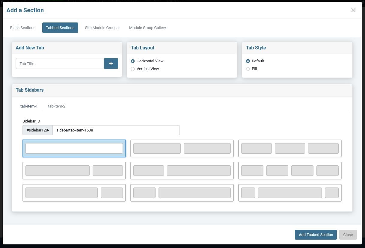
By default, you will be given
two tabs
in your section, labeled
tab-item-1
&
tab-item-2
. For obvious reasons, we suggest renaming these tabs. Just click on the name in the tab and type in the new name.
Add New Tab
Often two tabs won't be enough, so you can add tabs in the Add New Tab pane. Just enter the name in the box and click the
[ + ]
button. It will be added to the tab group in the
Tab Sidebars
pane.
Tab Layout
Here you can choose a Horizontal or Vertical layout for your tabs.
Horizontal View is the default and it will give you a full-width section with tabs running across the top.
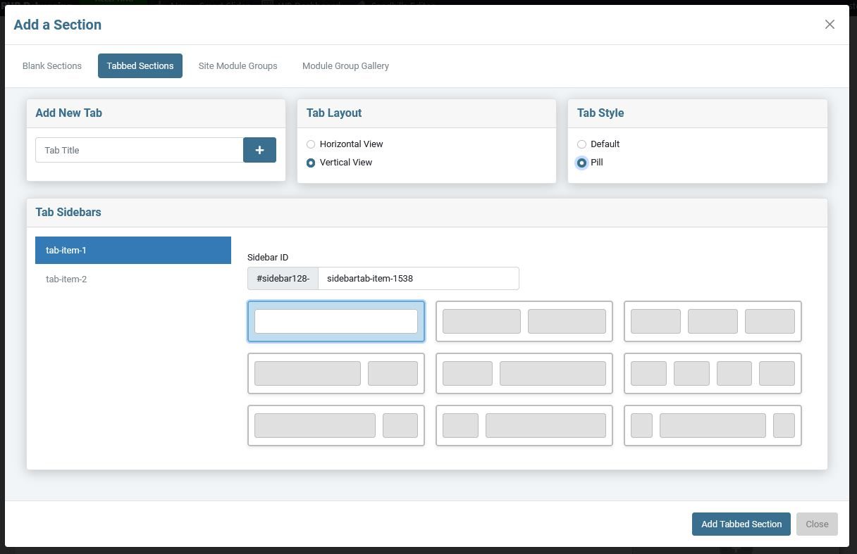
The Vertical View will give you tabs on running vertically up and down the left 3 columns of space. The remaining 9 columns of width is section that will hold your widgets. (There are still 12 columns in these sections.)
Tab Style
Here you can choose what the selected tab looks like. The default is the normal tab layout. Pills will highlight the active tab in a different color. In the example below, you can see the Tabbed Sections is a Horizontal Pill and tab-item-1 is a vertical pill.
Elements in the tabbed sections are classed to make it easy to style each element in your style.css file.
Vertical View with Pill style tabs.
Tab Sidebars
This section is where you manage the sidebars themselves.
-
You can change the name of your tabs by clicking on the name and typing over it.
-
Be aware that you can not reorder the tabs. You will have to rename each tab to change the order. Plan ahead.
-
You determine the structure you want for each tab to accommodate the widgets it will need.
- You also can get each tab's sidebar ID here so you can style each tab individually.
Once you are done setting up the individual tabs, just click the
ADD TABBED SECTION
button and you are ready to add your widgets and content with the editor.